How to Cure Adobe's Laziness
January 30, 2010
Steve Jobs called Adobe "lazy." He was referring to Flash, but it's also spot-on for Adobe's Creative Suite line of software most often used by Graphic Designers. With multi-touch software interaction bearing down on us like a freight train, Adobe is about to be obliterated at the crossing. With their Creative Suite stagnating, Adobe is one clever competitor away from becoming obsolete.
Here are 5 things Adobe can do to save itself and rekindle the excitement Designers once had when sitting down to use Adobe software.
1. Go Multi-touch
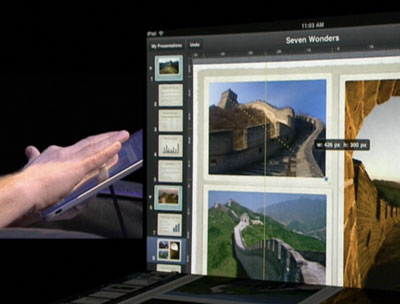
Multi-touch and gesturing is so much more natural than wrangling a mouse, keyboard, or pen tablet. This new way of interacting between human and machine gets us back to the way fine artists interact with pen and paper, paint and canvas, even ad layout before the age of computers.

Multi-touch page layout with iWork.
What if I could start drawing shapes in Illustrator with my hands like I would on paper? Precisely laying out a magazine in InDesign with my finger tips, carefully gauging spacing with my eyes? How about burning and dodging photos in Photoshop with the flick of my wrist like I did in the darkroom? This would be a dream come true for all artists using a computer to output their work.
2. Give us a Designer's UI
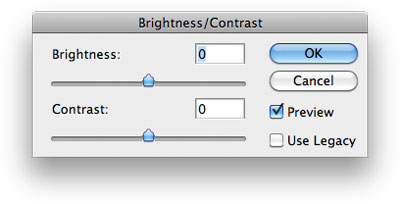
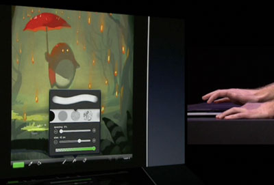
Adobe's user interface is over 20 years old. I'm stuck using these bland controls from the 1988 era while companies like Apple and guys like this give us beautiful controls that are masterfully crafted.

An example of a tired old Adobe control element.

An example of a UI control from Brushes. Take note, Adobe.
3. Hire some Graphic Designers
Since the Macromedia merger it's clear there's been zero consulting with people who actually use Adobe's creative software. Adobe UI Gripes points this out ad nauseam. Cryptic messages, inadequate type lists, abysmal handling of typography... Adobe needs to learn from its users.
4. Start Over. From Scratch.
Obviously, to implement any of these changes, you have to start over. All your software has to be rewritten to take advantage of today's and future technology. This is tough when you're sitting on a 20+ year-old code base, but look what's happened to Windows. Bloated, slow, unintuitive, unfriendly. Sound familiar?
5. Lead.
When Apple announced the iPad, they invited some big names up on stage to demo their apps and show off their innovative approach to multi-touch software interaction. EA showed us a whole new way to play games. MLB showed us a new way to interact with sports. Apple showed us a new way to interact with spreadsheets. Then someone showed us a new way to approach creative arts. But it wasn't Adobe on stage. It was Steve Sprang, a single developer who came up and showed us his Brushes app. This app is what Adobe should have been demoing and it should have been called Photoshop Touch. But instead, a multi-billion dollar company was trumped by one guy.
Leading will come naturally once Adobe gets its heart back in it and starts implementing the above ideas. It's tough to lead, especially since Adobe has no competition in the Graphic Design field of software.
Adobe can be Great Again
In the 1990s, Apple and Adobe pioneered the great digital transition in the world of Graphic Design. We're about to enter a new era with multi-touch interaction becoming more mainstream and I want to see Adobe at the forefront of this movement. I want to create with my hands, again, not using a mouse or stylus pen as a proxy. Adobe has the history to make it happen. I hope they do it before Apple, or someone else does. I hope Adobe is listening.