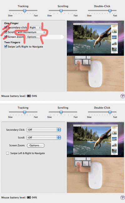
Funky Apple Magic Mouse Panel Design
I was reading the Ars review of the Magic Mouse and came across a screenshot of the new mouse's control panel. This is one of the few interface layouts from Apple that seemed to have almost zero thought put behind the design. Here's a little before and after of what I thought it should look like. Lots of simplification can happen here. Removing the separate checkmarks and drop-downs and replacing them with just drop-down menus really takes the business away from this panel. It's also more in line with the design of the Mighty Mouse and Spaces panels.
