Road Signs & Graphic Design
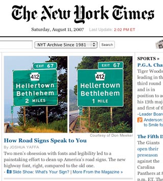
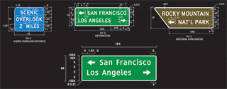
The New York Times has a front page featured article (The Road to Clarity) on the redesign of the typeface used on interstate signage in the United States. Amazingly, zero typographic consideration went into the approval of use of the typeface that adorns most of the current signage. The new typeface, Clearview, allows drivers to read road signs several hundred feet sooner. A worthy improvement. Look for Clearview to start replacing the old face as current signs become old and worn.
La Vergne
Sadly, the town I live in has no concept of typography. But that's pretty much expected. I apologize for the crappy photos, but you can imagine even from just the other side of an intersection how difficult it would be to read our road signs. Just a few of their flaws:
- All caps create illegible rectangles of white from a distance.
- Lack of letterspacing causes the letters to run together resulting in inability to distinguish between letters.
- Selection of a narrow typeface makes the above issues even more pronounced.
- No grid system results in the letters almost touching the white border of the sign making it even more difficult to recognize individual letterforms.
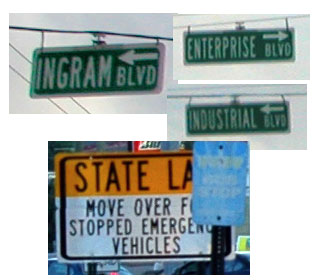
The black border on the "State Law" sign just kills me. It's thicker than any of the letters. Yet, the border is also thicker on the side than it is on the top and bottom. I don't think I've been in a town with worse signage than La Vergne.