An Exercise in Design
A couple months ago at work we took on the task of redesigning the email that is sent once a customer places an order. Basically, the receipt email. This is a great example of how good design can make everyday tasks easier, and information more accessible. This also happens to be one of my favorite types of design: Making things easier.
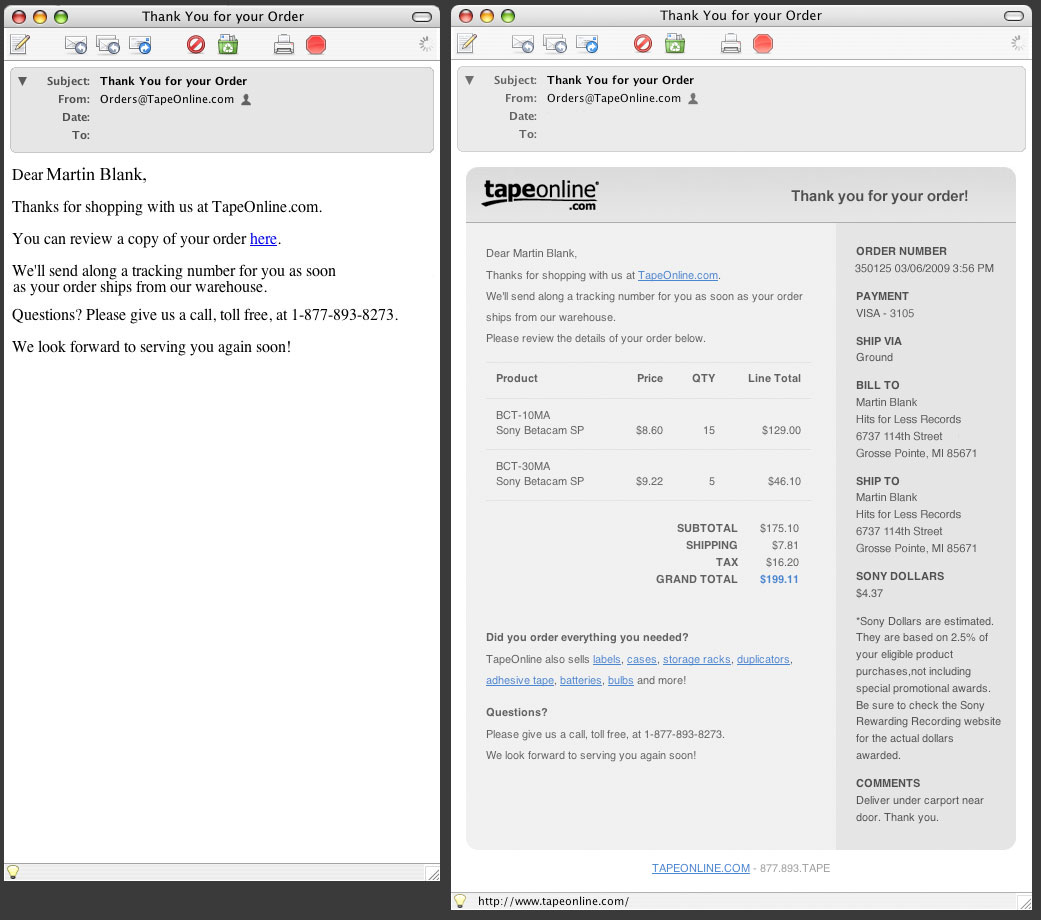
Looking at the old version, you can see that the information provided is very limited, requiring the customer to click back to the website in order to view any valuable information. For the customer, this means jumping between programs, waiting on their computer, waiting on their net connection, etc, etc.
So we wanted to get up to speed with most every other online vendor that provides a comprehensive receipt for their customers after purchase, including products purchased, an order number, billing and shipping info, and also a way for customers to quickly get back to the site for additional purchases. Here are the results of our efforts.
The feedback from customers was very positive. It also helped us internally to be able to see all this information in one folder in our inbox, rather than trolling through our website and making additional queries to the database just to get to this info. In the end we achieved greater accessibility to information while saving a little wear on our servers as well.